Mobile Journey Done Right
So you have a mobile presence, and all is well on Planet Earth. The sun is shining, rabbits are hopping and skipping through hayfields, and qualified leads will drop right out of the sky any second. Right?
Not so fast. Your mobile presence isn’t a guaranteed winner yet. Just because you finally have an app or mobile website, it doesn’t mean they will resonate in the hearts and minds of your prospective customers. As nearly 2 billion users turn to mobile for shopping, socializing and other needs, you need to be remarkable.
The way to do it is by creating a connected experience—one that’s personalized for the user and consistent across all platforms. Whether your prospects go from desktop to tablet and back again, or hit your mobile website before downloading your Android or iOS app, it should all feel like one unbroken, easy journey.
Here are a few examples of mobile offerings that get this right.
New York Times
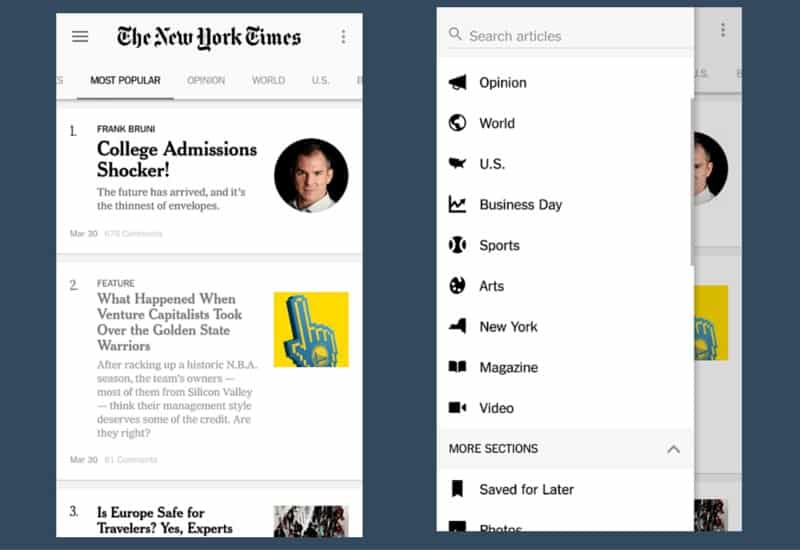
For subscribers of the influential newspaper, using the mobile New York Times app feels like living the good life. Whether you’re using a smartphone or tablet, with a cup of Joe on the side for ambiance, you’re just a tap (or, a swipe and a tap) away from expertly-composed content.
First, the app’s clean design replicates the feel of the Times’ desktop site, while simplifying the experience. If the desktop homepage is a multi-column smorgasbord of news items, the responsive mobile site and app are a sampling of exotic coffees at the new local café: on the mobile home screen, you see a single column of vertically-stacked “top stories” for the user to browse through.
Such is the beauty of customer-centricity: It’s idea for users who skim quickly through headlines to get the day’s “scoop,” and for those who slowly peruse the titles as they look for meaty content to consume, are served by the mobile experience. An iOS-only app, NYT Now, caters even more to the former group, featuring “snackable,” curated article summaries for the especially-busy reader.
With additional features like push notifications for breaking news and the ability to save articles and create customized “libraries” of content, NY Times app users never feel too far away from their favorite news source.
Yelp

If you’re trying out a new restaurant or bar, it’s a good idea to check out some reviews first. The Yelp experience, which smoothly follows you from desktop to mobile (and back again), has you covered.
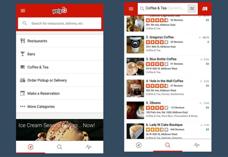
Upon opening the Yelp app and signing in, you’ll see a search box at the top that suggests “Search for restaurants, delivery, etc.” (which particularly speaks to users who are wondering whether to eat out or order in). Whether the user searches or taps on “restaurants,” “bars,” “coffee & tea,” or other items, he is shown the closest options using the device’s location services, with quickly-understandable star ratings. Most of the guesswork is gone, a cornerstone of a great personalized mobile experience.
The desktop site is cleanly synchronized with the mobile app. On both platforms, you’ll see the familiar red-bordered branding with search bars at the top, and filters that enable users to personalize their restaurant/café/bar selection to the extreme (Want free Wi-Fi, or to find places that are open at a certain time? Just specify.) Reviews follow logged-in users across devices, and Yelp asks if you want to review places you’ve looked up using the service, enhancing the connected journey.
Spotify

If music helps you survive your workdays, you’ve heard of Spotify (If not, how’s the rock you’re living under?). The Spotify mobile experience allows your favorite tunes to follow you everywhere, from your pocket to your office desktop, and wherever else life takes you.
While the desktop application takes on a “media player console” vibe with several areas devoted to searching and selecting songs, the Spotify aesthetic melds with mobile-optimized features on phones or tablets. Once signed in, the home screen shows you several horizontally-scrollable categories of playlists and radio stations, whether native to Spotify or created by you. Native Spotify playlists feature “album cover” visuals with recognizable artists and descriptive titles, such as “Rap Caviar” and “Acoustic Spring,” that let you know instantly what kind of music you’re in for.
As far as a seamless experience goes, Spotify is already famous for its social sharing capabilities and consistency across platforms. Added some neat playlists to your collection for your morning jog? Resume listening to them as you finish off the day’s last tasks at the office. Taking the train home? Download tracks so you can listen without data or Wi-Fi service. Ready to share the playlist with friends when you get home? Just connect your account to Facebook, if you haven’t done so already.
And control your desktop Spotify experience from your smartphone, just for the heck of it. Because you can. Because it’s connected.
Uber

Uber’s primary service—effortlessly “hailing” a ride based on your location—is mobile-exclusive. And on that front, Uber is winning.
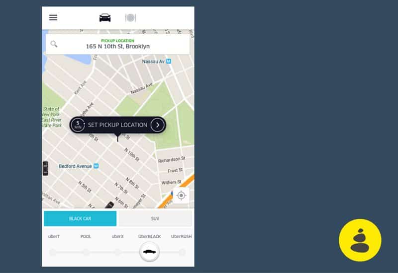
The app, first of all, is beautifully simple: you’re presented with a map showing available Uber drivers in your immediate area. (Changing your pickup location is as intuitive and touch-friendly as “dragging” the map so that the pin is centered on the desired spot. Want to be picked up where you are? Leave the map alone.) With a single tap of the button, you set your location, and wait for your driver. That’s it.
Because Uber’s service itself is the epitome of the connected experience—within minutes of tapping on your smartphone, a driver literally comes to you and picks you up—the app simply has to be as easy-to-use as possible. Special features, such as choosing a certain type of Uber car, communicating with the driver, or managing your account, are just a few more taps away. The app’s overwhelming simplicity, along with its intelligent use of geolocation, makes it a winner.
The Ideal Mobile Journey – Connected, Personalized, Simplified
Those three words—“let ‘em ring.” Those things are what all of the above apps achieve, and what your mobile offerings should strive for. It’s the only way to create a touchscreen journey that will satisfy your audience and cause them to convert.
Now, are you ready to go out and dominate your mobile market?
